Better Slide Decks in 60 Seconds
The most important key to better slide decks isn't a design approach - it's a simple philosophy...

This post contains Amazon Affiliate links which may earn me a little money. I will never recommend a product here that I don't personally use in my own work.
I'm developing next month's free webinar for the Bob Pike Group about what makes PowerPoint (or Google Slides or Keynote or Canva or Prezi or Pear Deck or or or) work. It's not the app that makes a slide deck good, that much I can promise you. Doesn't matter much what you build a deck with if you don't understand the purpose of your slides.
It was Garr Reynolds in his classic, Presentation Zen that opened my eyes to why Death by PowerPoint was a thing. I read it in 2006 and my slide decks haven't been the same since. Luckily!
The most important key to better slide decks isn't a design approach - it's a simple philosophy:
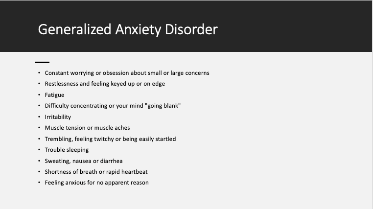
What does that mean? It means stop developing your talk, training, presentation, pitch in slide deck creation software. Do not start your design with your slides! Start with your message, your story, your desired outcomes. Use slides to evoke feeling, inspiration, motivation from your audience. Visuals are very good at eliciting feelings! You can go from something like this:
To this:

The first slide uses the wrong medium to share important information. The second slide capitalizes on the real potential of slide decks - presenting visuals that engage learners emotionally (which helps learner motivation).
Are you wondering where you're going to put all that helpful detailed information in the bullet points in the first slide? Of course you are. Put it in your handout. Think about how you learn and get information. If you see a lot of text, you want to read it, don't you? What is the best format for delivering lots of important, complex text? Not slide decks! If you'd like your learners to read information in your session, give them an article, a post, a list of important things to ponder. If you want your learners to listen to you, don't distract them by giving them a ton of reading to do on a slide. They won't do both.
One of my more memorable train the trainer experiences was when I was getting certified to deliver a suicide prevention curriculum for Rutgers, years ago. The trainer put up a slide with a bunch of bullet points like the one above. And she said, "Don't read the slide to people because nobody likes to have the trainer read the slide. Think of the slide like wallpaper - it's just there in the background." (She also said "sugar baby" a lot when we frustrated the hell out of her - which we did, often. We loved her, though!)
All I can say is don't do this. Don't show a slide with a ton of information on it, and then treat it like wallpaper. It sends a strange and conflicted message to your audience about what information is valuable and what isn't.
Pick the right medium for the information you need to share. Pick the right information for the medium:
Slide decks - visual aids like images, diagrams, illustrations, charts, data, titles, headers, memes, etc.
Handouts - interactive worksheets, templates, detailed information, resources
Lecture - stories, jokes, narrative illustrations of key ideas, and very, very brief delivery of info dumps
This free webinar I'm doing is on 4/20/23, so if you want a whole hour on this topic, sign up here! Even if you can't make it, you'll get the handout and link to the recording.
Also, if you're a trainer or an Instructional Designer, or otherwise interested in this stuff, BPG offers a whole ton of great information in our free webinars. Check them out here.